|
|
|
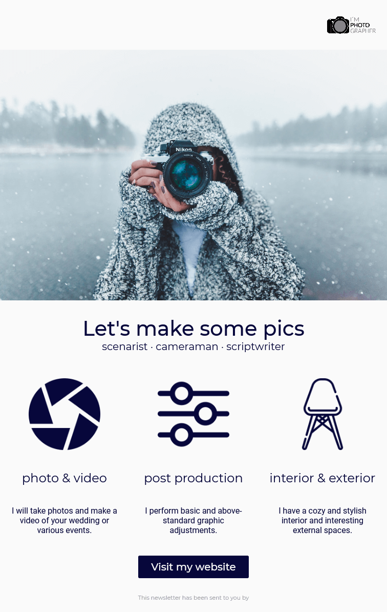
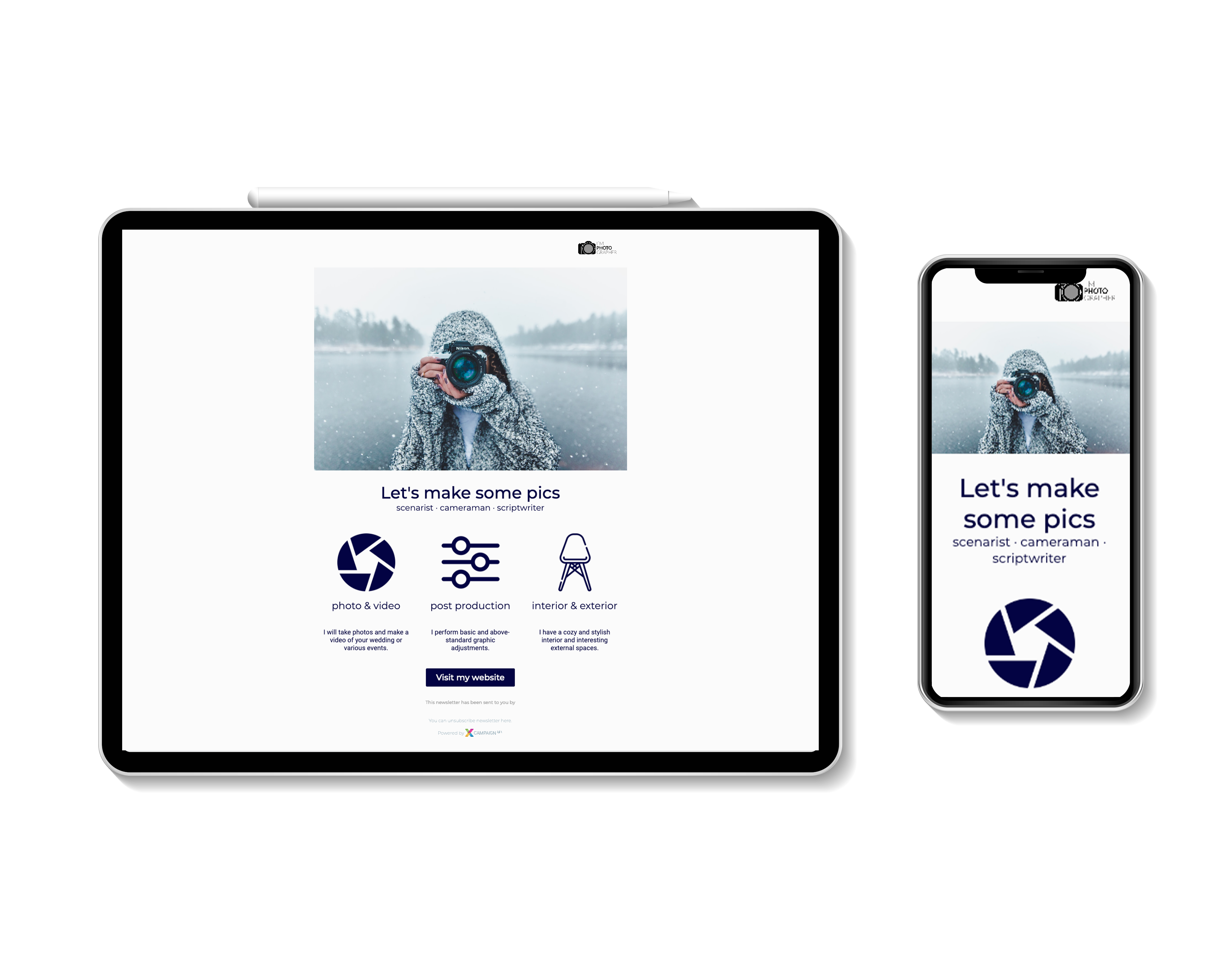
Choose a draft from our menu of themes in the Template Library draft that best suits your mailshot content and design requirements.
Then all you have to do is change pictures, add texts and hyperlinks, select the colors matching your corporate identity, and you’re done.
Moving, deleting, and adding design blocks are standard functions.
Supported Design Blocks
Design Blocks Determined for the Mailshot’s Content
Your chosen template will contain just some of the design blocks listed below.
Of course, you always have the option to add any of the blocks to your mailshot’s content.
You can find out how to do this in the General Behavior of the Template section.
Do you need to customize your design?
Everything that can be changed in the template can be found here.
In addition, all templates can automatically change design according to the design of your website.
|
||
|
|
|
|
||
Design Blocks Determined for the Mailshot’s Header/Footer
We have prepared design blocks that are necessary for the mailshot in the template’s header and footer. You can partially edit these blocks.
Brief Description of Design Blocks
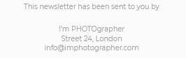
Logo
This design block combines these elements:
-
the company logo
-
text (company name)
-
a hyperlink
On mobile phones, both the logo and the header will be centered.
Paste with |
Computer |
Mobile Phone |
|
|
|
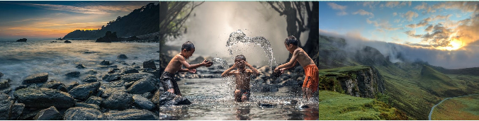
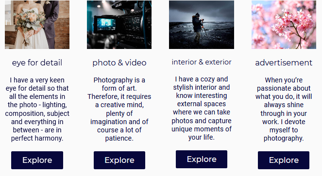
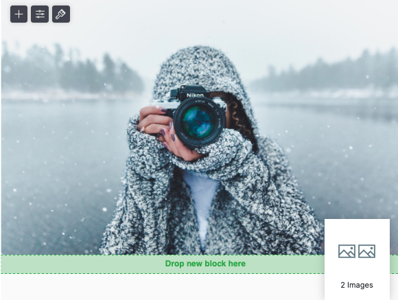
Image
Image inserts a clickable image into the template.
This design block combines the following elements:
-
an image
-
a hyperlink
One, two, three, or four images can be inserted into the template. Their placement automatically adjusts to the width of the device.
On mobile phones, the images are placed below each other.
One image
Paste with |
Computer |
Mobile Phone |
|
|
|


Two imagess
Paste with |
Computer |
Mobile Phone |
|
|
|


Three images
Paste with |
Computer |
Mobile Phone |
|
|
|


Four images
Paste with |
Computer |
Mobile Phone |
|
|
|


Recommendations for image sizes can be found here.
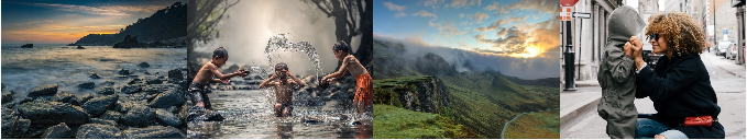
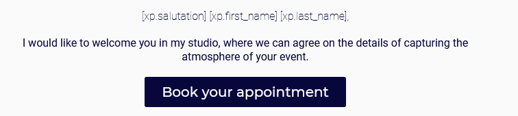
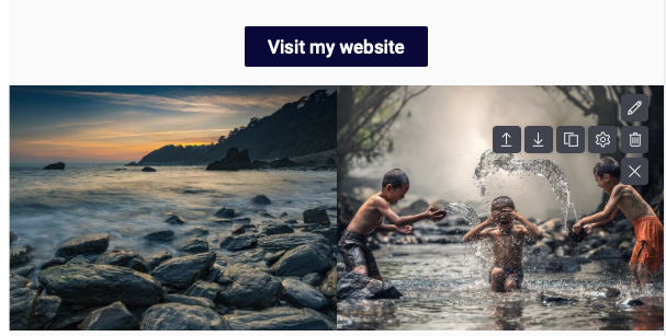
Salutation and Content
This design block allows you to address the recipient by name and surname. If the recipient has a value of a salutation, first and last name stored in their data, they will be automatically added when sending the mailshot. Otherwise, the value before the comma will be empty. This design block combines the following elements:
-
the recipient’s salutation
-
a text paragraph
-
a button with a hyperlink
Example of element variants:
Salutation |
Salutation and text |
Salutation, text and button |
Paste with |
Computer |
Mobile Phone |
|
|
|

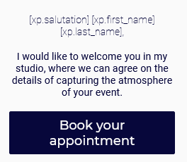
Salutation by Gender and Content
This design block automatically selects the salutation defined in the design block (e.g. "Dear Sir") according to the gender of the recipient.
The gender of the recipient does not need to be known.
When generating personalized mailshot content, the values in the block are automatically set according to the salutation value stored in the recipient details.
In addition to the salutation, the recipient’s first and last name must also be stored in the recipient details.
If the recipient’s name and/or recipient is not stored in the details, the missing value before the comma will be empty.
In the case of an unknown address, the latter shall be used.
A design block combining the following elements:
-
the recipient’s salutation according to their gender
-
a text paragraph
-
a button with a hyperlink
Example of element variants:
Salutation |
Salutation and text |
Salutation, text and button |
Paste with |
Computer |
Mobile Phone |
|
|
|


Headline and Subheadline
This design block combines these elements:
-
Significant title
-
Subtitle
On mobile phones, the elements are placed below each other.
Paste with |
Computer |
Mobile Phone |
|
|
|

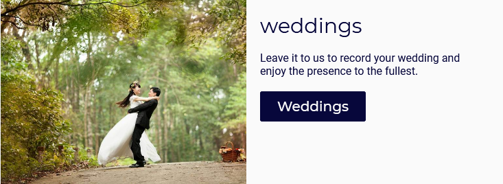
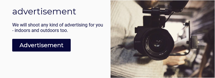
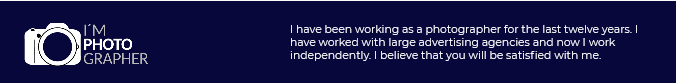
Image and Content
This design block is made up of two columns combining the following elements:
-
an image in one of the columns
-
in the other column:
-
the title
-
a text paragraph
-
a button with hyperlink
-
This block has two options for image location (left or right).
On a mobile phone, the columns are placed below the image.
Image and Content
Paste with |
Computer |
Mobile Phone |
|
|
|


COntent and Image
Paste with |
Computer |
Mobile Phone |
|
|
|

Recommendations for image sizes can be found here.
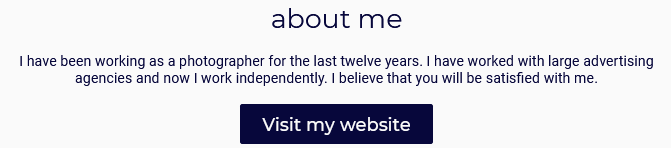
Text and Button
This design block combines the following elements:
-
the title
-
a text paragraph
-
a button with hyperlink
Paste with |
Computer |
Mobile Phone |
|
|
|


Text
Design block for entering a text paragraph.
Paste with |
Computer |
Mobile Phone |
|
|
|


Button
This design block inserts a button with the hyperlink to the template.
Paste with |
Computer |
Mobile Phone |
|
|
|


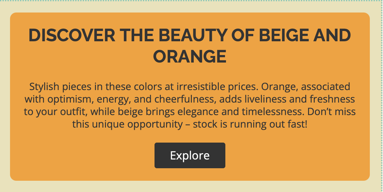
Highlight
You can use the variant to highlight important information or an important part of the message. It makes key details stand out and ensures they are not overlooked. As with buttons you can use rounded corners.
-
Title
-
Text paragraph
-
Button with link
You can use all parts or just some of them.
Paste with |
Computer |
Mobile Phone |
|
|
|
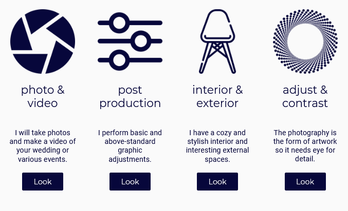
1-4 Icons and Content
This design block is created up to four columns. Each column contains the following elements:
-
a large icon
-
the title
-
text
-
a button with a hyperlink
On mobile phones, the columns are placed below each other.
Design block settings:
-
Individual
You can choose your own background, text and button color, or even text alignment for each column. This setting is available by clicking on the icon.
icon. -
Common
Settings such as number of columns, icon size, heading size, button shape, etc. are available by clicking on the icon.
icon.
Paste with |
Computer |
Mobile Phone |
|
|
Columns are placed below each of other |
Recommendations for image sizes can be found here.
Image Box
This design block combines the following elements:
-
an image
-
a text paragraph
-
a button with hyperlink
This design block can have up to four columns. The column width adapts to the device used. For multiple column variants on a mobile phone, the columns are placed below each other.
Image Box 1
Paste with |
Computer |
Mobile Phone |
|
|
|

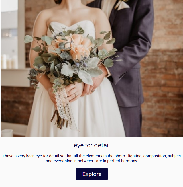
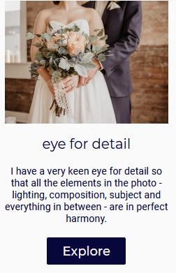
Image Box 2
Paste with |
Computer |
Mobile Phone |
|
|
Columns are placed below each of other |

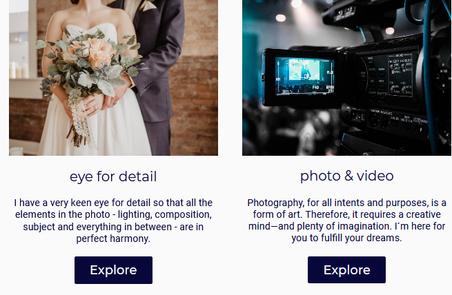
Image Box 3
Paste with |
Computer |
Mobile Phone |
|
|
Columns are placed below each of other |

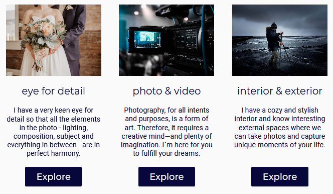
Image Box 4
Paste with |
Computer |
Mobile Phone |
|
|
Columns are placed below each of other |
Recommendations for image sizes can be found here.
Separator
A design block intended for separating blocks that are located in the content part of the mailshot. You can change the color of the dividing line and its background, the weights, and style of the line.
The block adapts to the width of the device.
Paste with |
Computer |
Mobile Phone |
|
|
|


Strips
This variant is intended for separating blocks placed in the content part of the mailshot.+ Unlike the monochrome version, Separator allows you to specify up to 12 different colors. You can create separators with a color gradient or different colors. How many colors you use is up to you.
The block adapts to the width of the device.
Paste with |
Computer |
Mobile Phone |
|
|
|


Logo/Impressum
The block combines these elements:
-
a logo
-
text
On mobile phones, the text part is placed under the logo.
Paste with |
Computer |
Mobile Phone |
|
|
|

Social Networks
Social networking logos are generated automatically if a network link is entered. Custom logos cannot be used.
This block combines the following elements:
-
logos and hyperlinks to www pages of known social networks
-
an email address
-
a phone number
On mobile phones, logos are placed below each other.
Paste with |
Computer |
Mobile Phone |
|
|
|


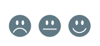
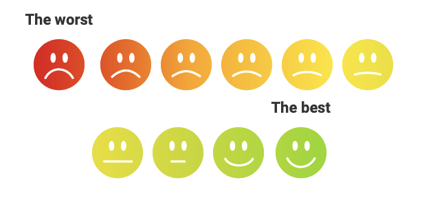
Net Promoter Score
Do you want to give your recipients the opportunity to score your mailshot? Include this design block in the content of the mailshot.
We have prepared a number of different types of scoring templates, you can find them in the block details in the NPS type section:
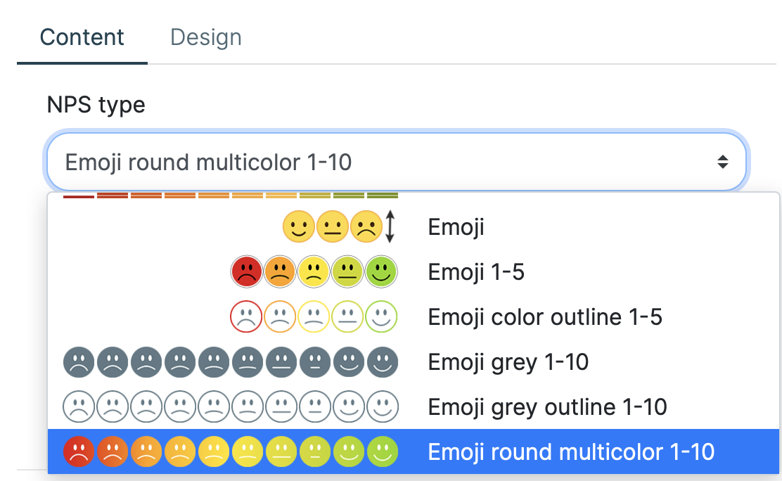
You can also define a custom headline to indicate the score section of the mailshot.
And how does the mailshot score work?
Each email sent will contain the selected score.
If the recipient of the email clicks on any of the options, they will be redirected to a predefined landing page and their response will be recorded in the mailshot statistics.
The design block contains the following elements:
-
selection of predefined templates for Net Promoter Score
-
hedline
The following image shows one of the possible templates for mailshot score.
Paste with |
Computer |
Mobile phone |
|
|
|

Design Block for the Template Header and Footer
No other design blocks can be added to the template header and footer. This part is reserved only for predefined blocks for Preview URL,Unsubscribe, and Copyright.
-
the position of the block is fixed
-
a block can’t be inserted
-
the text of the unsubscribe link must be entered
-
elements you left blank will not be visible in the template or in the mailshot content
-
the design block will not be shown if all of its elements are empty
Preview URL
A predefined text block designed to preview an email in a web browser is inserted in the mailing header. This block only appears when you view an email on your computer.
You can edit the content of an element by clicking on the  icon directly in the template editor.
Paste with |
Computer |
Mobile phone |
Can’t be inserted |
|
the block is not displayed |

Unsubscribe
Design block designed for the footer only. This block contains a mandatory field for entering an unsubscription link.
The block adapts to the width of the device.
Paste with |
Computer |
Mobile Phone |
Can’t be inserted |
|
|


Copyright
Design block designed for the footer only. It contains a text, XCAMPAIGN logo, and link to the product information page.
Only the text field can be edited, the rest of the fields are hidden. If you have a paid subscription, you can delete the text. The block will then not be displayed in the mailshot.
Paste with |
Computer |
Mobile Phone |
Can’t be inserted |
|
|


Imprint
This design block is inserted into the mailshot footer and you can use it to insert up to 4 links to important information listed on your website (e.g., pages with the terms of use, personal data protection, etc.).
This block combines the following elements:
-
Hyperlinks (up to 4)
-
text
On mobile phones the text part is placed below the hyperlinks.
Paste with |
Computer |
Mobile Phone |
|
|
|
Rules for Image Insertion
If you observe the following rules, your emails will always behave professionally.
The inserted image automatically adjusts to the desired size and the aspect ratio is maintained when scaling.
Design element |
Image size |
|
|
|
|
|
|
|
General Behavior of the Template
-
After clicking on the selected design block, the editing tools will appear on the right side.
-
The template has preset sample content.
-
The editor dialog is used to enter your own content, which can be opened for each element by clicking on the
icon.
In addition to the content, you can also define the desired design block settings (colors, font sizes, etc.). -
If the default value (i.e., lorem ipsum) remains in the text box, an icon
 will be displayed next to the editing field.
The content can be also checked directly from the context menu .
.
All the blocks where the default value was found are highlighted. -
You can also insert field names from your data structure into the text field to prepare more personalized content of your maishot.
Just use the option Insert a Data Field, if offered: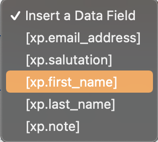
-
The button doesn’t appear in the block until you enter the hyperlink value.
-
All hyperlink fields are empty by default (except the unsubscribe link).
-
The design block does not appear if all its elements are empty.
-
-
The selection of fonts used for headings and texts is part of the design element’s settings for the Preview URL.
-
Design blocks placed in the main part of the template, i.e., outside the template header and footer, can be:
-
Move freely using the icons

 or mouse
 -
copied (
 ) and deleted (
 ).
).
-
-
You can change the colors (text, buttons, background), fonts or logos in the whole mailshot very quickly using the
 icon.
For more information, see Changing the Mailshot Design Using X-Designer.
icon.
For more information, see Changing the Mailshot Design Using X-Designer.
Adding a New Design Block
To add a design block, use the  icon on the top left.
A menu of available blocks will open in the right panel.
icon on the top left.
A menu of available blocks will open in the right panel.
Select the desired block.
Either:
-
Using the button Create:
The placement of the new block depends on whether the design block was selected before clicking the button: Example of a selected design block
Then a new block is inserted after it:
Otherwise, the new block is inserted in the middle of the mailshot.
or
-
Move the selected design element to the desired location of the mailshot using the mouse:
Customize Template Appearance
If you can edit the design element’s appearance, the Design tab is displayed in the details.
There you can also edit the appearance of the individual elements used in the design block (e.g., the title, text, buttons, etc.). You can recognize the element you are currently working on from the field name; the edited property is determined by the text in brackets, such as "Button (background color)".
Once you have modified one of the default design elements, your block settings will be used when you insert the same block into the edited mailshot. It is therefore not necessary to repeatedly make the same changes to the appearance repeatedly.
|
Note
|
If you only need to change the color of part of the text, use the editor directly on the text field. More information here. |
Custom Text Settings
Font Family
You can specify which font will be used for the title and which for the other text.
The font family selection enables by clicking on the icon directly in the master editor.
Click on the file and select the desired font family. This always consists of several fonts. The first font in the selected list will be used as the default font. Additional fonts will be used sequentially if the email recipient does not have the first choice font installed on their computer.
Text Aligment
Select the desired text alignment method (left, center, right) from the predefined options. If you edit the alignment for the design elements 1-4 Icons and Content and Image Box this setting is common to all columns contained in the element and is only available in the first column edit.
Font Size
Depending on the type of design block selected, the font size can be set for headings, buttons and the text itself. The size can be changed with the arrows next to the field or with the sidebar.
Bold Text (font- weight)
Do you want to use a bolder font or a thinner one? Just click on the box to choose from the selection the one that suits you best.
Change in Text Size
Do you have the text ready and do you need it to be, for example, all in caps?
Just click on the box and choose how the text should be changed:
-
all uppercase (uppercase)
-
all lowercase (lowercase)
-
all first letters uppercase (capitalize)
-
left as written (none).
Inner Margin (Padding)
This setting specifies the distance between embedded content, (e.g., button text) from the top and bottom edges of the element into which the content is inserted (e.g., from the edge of the button).
This term is known in design as "padding".
Button Shape (border-radius)
Using the border-radius you can set whether the button will be rectangular or have rounded corners (and how much it will be rounded).
You can change the size using the arrows next to the field or using the sidebar.
Color of Entire Text
You can change the color of text, the text’s background, and button backgrounds. The selected color code and its name are shown in the field and, on the left side, you can see a preview of the color. You can see at a glance what color is currently set.
Select a Color from the Palette
To change the color, click on the field and select the desired hue from the select box (from the predefined palette).
Defining Custom Colors
To change the color:
-
Click on the color name box.
-
Select the option Other color.
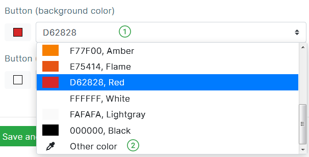
-
Instead of the original color name, the text "Other color" is in the field.
If you know the hexadecimal color code, write it directly in the box (e.g.,d62828).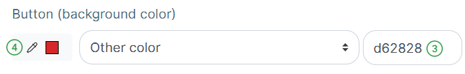
-
If you need to select a hue directly from the palette, click the
 icon next to the color preview.
A dialog for color selection is opened.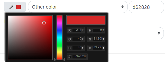
Use one of the following options to select a color:
-
Click the mouse in the box on the desired color hue.
-
In the panel above the hexadecimal code, select the desired color type (for example, shades of green) and then specify the hue by clicking the mouse in the box above the panel.
-
If you know the hexadecimal color code, write it directly into the field (e.g.
4c6874).Confirm your selection with the button Close. The window will close and you can see the selected shade in the color preview.
-
Change Part of the Text
Do you need to highlight a part of the text or add a link to the text?
-
Select the edit block of the text you need to change by clicking.
-
Click the edit button (
icon).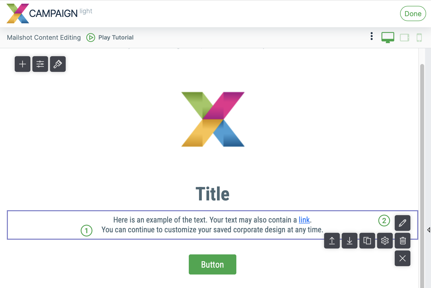
-
The content editing dialog opens. You have a number of icons familiar from text editors.
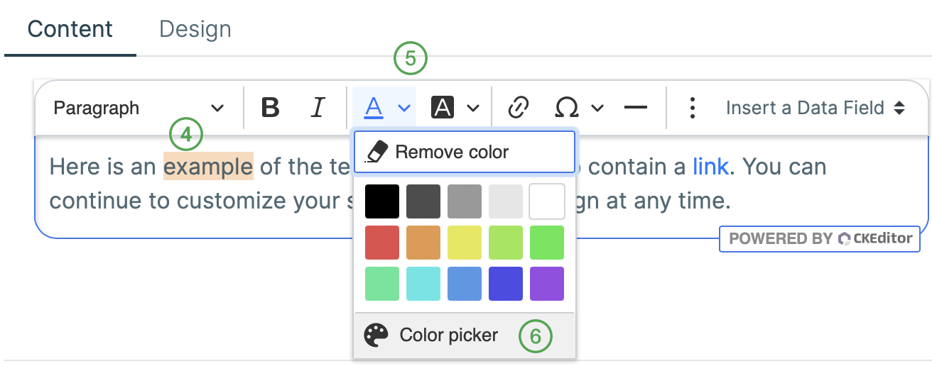
-
Select the part of the text you want to change.
-
Select the appropriate edit button, e.g. the text color button. You can select a color from the predefined color palette.
-
To specify a color outside the preset color range, click Color picker. The color selection dialog opens:
Use one of the following options to select a color:
-
Click the mouse in the box on the desired color hue.
-
Enter the color in the field HEX using its hexadecimal code.
-
In the panel above the hexadecimal code, select the desired color type (for example, shades of green) and then specify the hue by clicking the mouse in the box above the panel.
Confirm your color choice by clicking on the
 icon.
Colors added using the option Color picker are automatically added to the Document Colors
icon.
Colors added using the option Color picker are automatically added to the Document Colors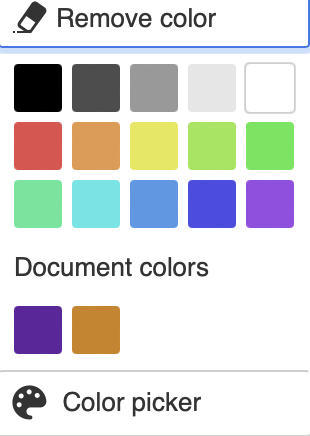
-
Changing the Mailshot Design Using X-Designer
Do you have your own website and want your mailshots to use the same design?
Just choose the X-Designer when selecting the content type.
X-Designer scans the specified web page and creates your new template using your company logo, colors and fonts.
The template created in your corporate design contains the most commonly used design elements.
The template can then be edited in the same way as the templates it offers Template Library.
You can also use the functionality on any mailshot created from the templates offered on the Template Library.
Just open X-Designer by clicking on the icon
and select the option Web Page.
Enter your website in the field and click on the option Start.
X-Designer automatically creates a template from the specified website according to your corporate identity.
For more information about using X-Designer, please see here.